
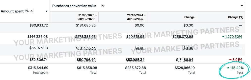
Doubled Revenue In 7 Months
A US home improvements ecommerce brand had a deep catalogue and a quality product line but was running a Meta account designed for impulse ecom, single-session conversion expectations on a category where buyers research for weeks, no visualisation support for "how will this look in my space," and no creative positioning against the big-box and marketplace alternatives every buyer was comparing them to. Seven months after building a discovery → consideration → conversion funnel, integrating in-space visualisation into the creative, and putting comparison positioning at the front of every concept, revenue more than doubled at a 1.95x ROAS.
- Built a three-stage funnel matched to how home improvement buyers actually shop: discovery (inspiration-led), consideration (room visualisation + comparison), conversion (delivery/install reassurance + offer).
- Used in-space visualisation, room mockups, AR previews, "in your living room" content, as the creative bridge that took prospects from "I like it" to "I can see it in my house."
- Killed the installation and delivery anxiety that quietly tanks home improvement conversion: white-glove delivery, assembly options, lead-time clarity, and return-protection guarantees surfaced in creative, not buried on PDPs.
- Built comparison-positioning creative explicitly framed against the big-box and marketplace alternatives every prospect was already weighing, on quality, service, lead time, and total cost.
A Consideration-Heavy Category Being Run As An Impulse Channel.
The brand had a real product line and a competitive price point, but the Meta account was structured as if home improvement worked like apparel or consumables, single-touch, single-session, "click and buy." Home improvement buyers don't behave that way. They research for weeks, save dozens of options, comparison shop across multiple retailers, weigh delivery times, and try to picture the thing in their actual space before committing. The account wasn't designed for any of that, and the cost curve showed it.
Single-Session Conversion Expectations On A Multi-Week Buyer
Every campaign was Purchase-optimised against cold traffic, with no awareness or consideration layer feeding into it. Buyers who needed three or four touches before they were ready to commit were being treated as failed conversions on the first click. The algorithm was being asked to find single-session purchasers in a category where they barely exist, and burning budget chasing the fraction that did.
"How Will This Look In My House" Going Unanswered
For home improvement, the single loudest unasked question is "will this fit / suit / look right in my space." The creative wasn't helping. Every concept was a clean studio shot of the product against a neutral background, beautiful product photography, completely useless for the actual decision. Without visualisation support, buyers were defaulting to the safer choice: someone else's catalogue with a better imagination tool.
Installation, Delivery, And Assembly Anxiety Going Unaddressed
Big-ticket home improvement comes with a stack of operational anxieties: delivery timing, lift access, assembly complexity, return logistics if it doesn't fit through the door. None of it was being surfaced in the creative or above the fold on PDPs. Prospects were doing the work the brand should have been doing, Googling reviews to figure out delivery experiences, checking subreddits for assembly stories, and dropping out somewhere along the way.
No Comparison Positioning In A Hyper-Comparative Category
Every home improvement buyer is comparing against Wayfair, Amazon, Home Depot, B&Q, and 4–6 niche competitors. The brand had genuine advantages, better materials, faster delivery, better customer service, longer warranties, and was saying nothing about any of it. In a category where the buyer's mental tab is open across half a dozen comparison sites, silence on differentiation is losing by default.
Match The Funnel To The Buyer's Actual Research Behaviour.
Home improvement isn't ecom-as-usual. The buyer's journey is closer to a high-ticket considered purchase than a single-click conversion, and the brands that scale on Meta in this category are the ones that build a funnel that matches that reality. We rebuilt around the three-stage buyer journey, addressed the visualisation and logistics anxieties that kill conversion, and stopped letting comparison happen in the buyer's head without the brand having a voice in it.
Three-Stage Discovery → Consideration → Conversion Funnel
Replaced the single conversion-optimised structure with a three-layer funnel:
- Discovery layer, inspiration-led creative optimised for engagement and ThruPlay. "Shop the look" room scenes, lifestyle context, before/after home transformations, design trend content. Captured prospects in research mode without trying to close them.
- Consideration layer, conversion-optimised against engaged audiences from the discovery layer. Product-specific creative, visualisation content, comparison framing, social proof.
- Conversion layer, retargeting against engaged-but-unconverted traffic. Offer mechanics, urgency, delivery reassurance, "saw this and didn't buy" sequencing.
Each layer fed the next. Engaged-video custom audiences moved from discovery into consideration. Add-to-cart and product-view audiences fed into conversion. The algorithm finally had a structured pipeline of warming traffic to work with, instead of being asked to find single-session purchasers from cold.
Three-Stage Funnel ArchitectureIn-Space Visualisation As The Creative Bridge
Built a visualisation track specifically to close the "how will this look in my house" gap:
- Room-scene content, every hero SKU shot in 4–6 realistic room contexts (living room, bedroom, kitchen, garden) so prospects could see it in something that resembled their own space
- AR-style previews where the platform supported it, "see it in your room" hooks driving to AR-enabled landing experiences
- Side-by-side scale references, the product next to common reference points (sofa, person, door) so size translated immediately
- Customer "in their home" UGC, actual buyers showing the product in their actual space, not staged studio sets
Visualisation content carried disproportionate weight in the consideration layer, it was the creative type that converted research-mode browsers into purchase-mode buyers.
In-Space Visualisation CreativeInstallation, Delivery & Assembly Reassurance
Surfaced the operational story prospects were quietly worrying about:
- White-glove delivery options named in creative and on PDPs above the fold
- Lead time clarity, "in stock, ships in 3 days" rather than buried delivery estimates
- Assembly options, pre-assembled, partial-assembly, full DIY, with time/skill required spelled out
- Lift and access guidance, "fits through standard UK door," "two-person lift recommended"
- Return protection, extended return windows for big-ticket items, with the policy stated in the ad, not the footer
The same products started converting at higher rates because the anxieties driving drop-off were being engineered out at the funnel level rather than left for the buyer to research alone.
Logistics ReassuranceComparison Positioning Against The Alternatives
Stopped pretending the comparison wasn't happening. Built a creative track that explicitly framed the brand against the big-box and marketplace alternatives prospects were already weighing:
- Quality comparison, material, build, warranty length, real-life durability
- Service comparison, lead time, customer service response time, return ease
- Total cost comparison, including delivery, assembly, returns, lifespan
- "What you're actually paying for", framing the apparent price gap against the real-world difference
The creative didn't disparage competitors, but it named the gaps clearly. In a hyper-comparative category, doing the comparison for the buyer is the single most powerful conversion lever the brand has, and the prior account had been leaving it entirely to the prospect to figure out alone.
Comparison PositioningSee What We've Done For Other Brands.
.webp)
Ready to stop guessing?
Apply for a free Paid Ads Audit + Custom Scaling Plan Powered By Our Predictable Scaling Quadrant™ Method. We'll pinpoint exactly where your budget is leaking and show you a clear path to profitable scale.
Joined by 1,500+ businesses